No two companies are alike, but the best brands lead by example, building CX in a way that inspires and helps them grow.
In today’s digital economy, where most websites and apps look and behave the same, the risk isn’t in doing something different — it’s in blending in.
Business leaders are often sold the promise that “best practices” will drive results — better conversions, lower bounce rates, and increased loyalty. But when every brand adopts the same templates, patterns, and tone, customers disconnect. Sameness doesn’t differentiate — it numbs.
In the realm of Customer Experience (CX), emotional resonance, trust, and clarity matter more than raw functionality. If your website or app feels generic or overloaded, you're not building a brand, you're ticking boxes.
Big brands know this, and you should, too. What drives innovation and consequently sales is about leading by example, and by knowing which examples to draw inspiration from.
Value-Forward Transparency
Since most brands build their journeys around transactions rather than trust, sustainability is often treated as an afterthought. 'Green theatre' undermines credibility when ethical statements are buried in PDFs on 83% of the car websites I've evaluated.
These days, however, consumers clearly value environmental efforts. It’s an important part of product development and the consumer journey. Getting this right is critical, and brands that work it out can win market share in a big way.
Polestar - Sustainability with Substance

One such winner is Polestar, a car brand that clearly champions environmentalism because of where it sits. As an EV – an electric vehicle – it does away with the shackles of petrol and gas, and finds a way to be sustainable, while still being a showroom brand.
It should come as little surprise then that Polestar’s site feels like a high-end showroom. Sustainability isn’t buried in fine print — it’s integrated through lifecycle emissions data and ethical sourcing transparency. Design is quiet, not cluttered.
Customer Journey

- Discover: Design and sustainability caught via articles and ads
- Explore: Clean site shows emissions data, ethical sourcing
- Compare: Car configurator, specs, Polestar Spaces
- Buy: Online purchase or showroom test drive
- Own: Polestar app, software updates, servicing
Exec Insight: Most corporate ESG content hides in reports. Polestar makes it visible — and usable — within the customer journey.
Pain Point: Many automotive sites overwhelm users with specs. Polestar simplifies the experience and earns trust in the process.
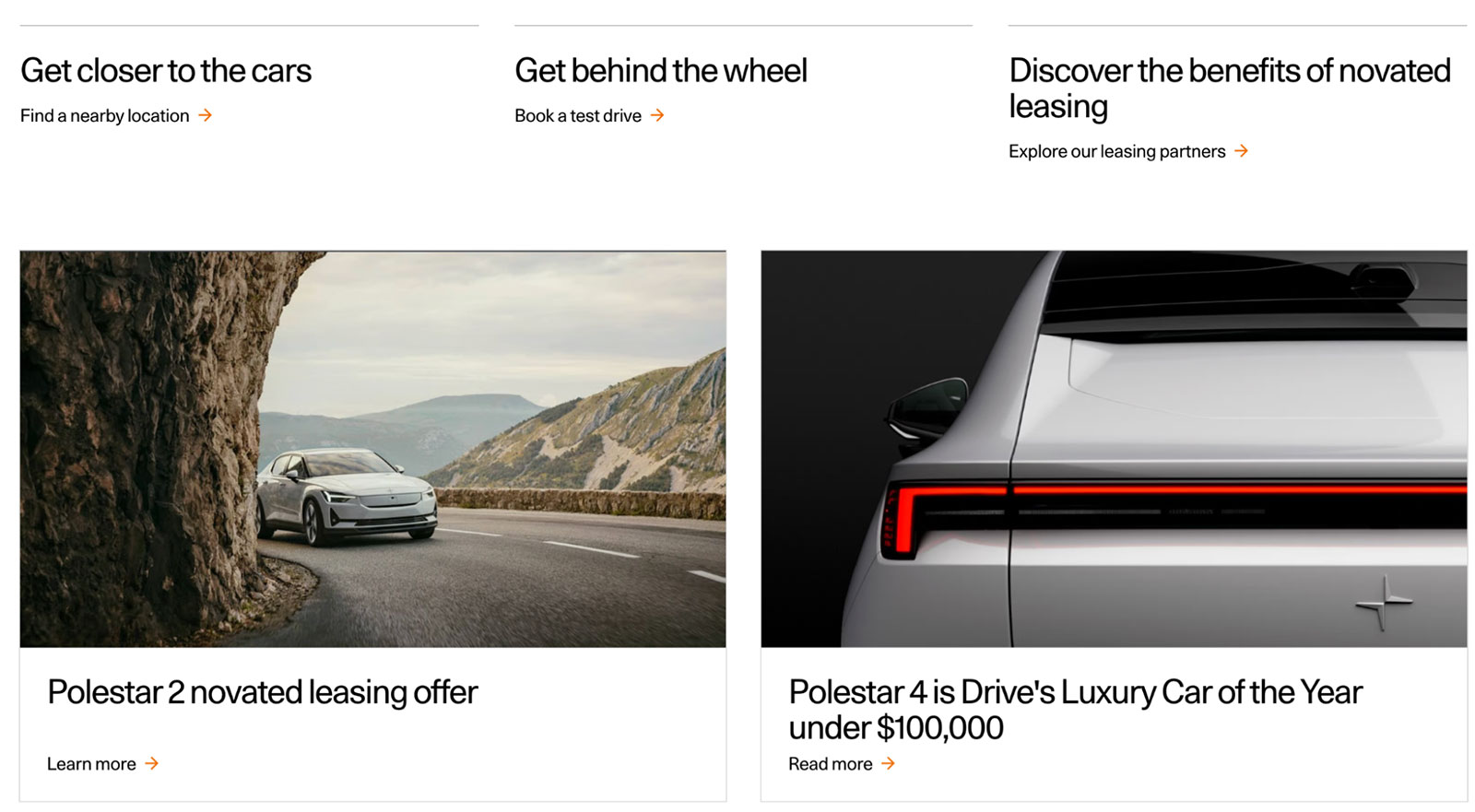
Website: polestar.com
Industry: Electric Vehicles
CX Principles:
- Sustainability as Differentiator
- Emotional Engagement
- Invisible UX
Pounce’s Perspective
When UX architecture is driven by values, true distinction occurs. Environmental, Social, and Governance (ESG) is converted from marketing into quantifiable CX by integrating effect data into key interactions (such as Polestar's lifetime emissions tracker). With transparency becoming the new luxury, this creates a premium perception.
Frictionless Storyselling
Design and minimalism often go hand-in-hand, but depending on the stage of the journey, individuality can go out the window. When individuality is eliminated instead of clutter, minimalism fails.
Sparse layouts are particularly misinterpreted by furniture firms as sophistication, which can lead to sterile galleries that resemble digital showrooms and function similarly (with average bounce rates of 68%). We all know what that looks like: a desolate warehouse of beds and sheets, and the vibe that walking in isn’t an experience you’d want to invite. The online user is no different.
Vitra - Minimalism with Meaning

Vitra’s site is more of a magazine than a marketplace. It tells stories, curates inspiration, and lets the user explore without pressure.
Customer Journey

- Discover: Pinterest, design magazines, Instagram
- Explore: Designer stories, curated inspiration
- Compare: Material info, room visualisers
- Buy: Online shop or find a local dealer
- Own: Product care, heritage content, re-engagement
Exec Insight: Minimalism isn’t less content — it’s less friction. Vitra guides, it doesn’t push.
Pain Point: Most furniture sites bury users in filters and sales CTAs. Vitra uses narrative to elevate design literacy and brand trust.
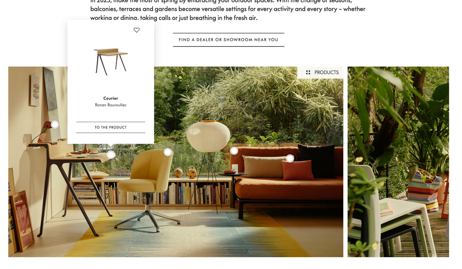
Website: vitra.com/en-as/home
Industry: Furniture & Interiors
CX Principles:
- Emotional Engagement
- Invisible UX
Pounce’s Perspective
Making narrative into navigation is how Vitra succeeds. The 'magazine' style exemplifies a UX specialist’s fundamental rule: every exchange must further the storyline or goal.
It’s no different to making a movie or telling a story. This is interface psychology, not content marketing. Without pushy CTAs, conversion increases (by as much as 19% from research) when users self-educate through storytelling.
Design That Breaks the Rules
A crucial reality is often overlooked by e-commerce's fixation on speed-to-cart: expensive purchases require mental room. Luxury websites can commoditise themselves when they put a higher priority on a smooth checkout than on storytelling, as our research has shown. A staggering 70% of online shop experiences end up this way, damaging their chances for a success: a truly happy customer.
Nomos Glashütte - Design That Breaks the Rules
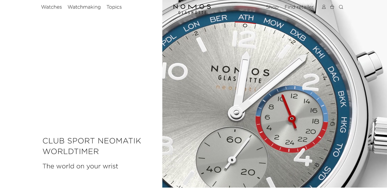
Nomos rejects standard ecommerce flows. It feels editorial — slow scroll, unexpected layouts, plenty of space. The result? A deeply authentic brand experience.
Customer Journey

- Discover: Found via design blogs, collectors
- Explore: Slow scroll, brand storytelling
- Compare: Watch specs, movement guides
- Buy: Direct purchase, boutique partner
- Own: Service info, newsletters, loyalty
Exec Insight: Speed isn't always the answer. For premium brands, depth builds value.
Pain Point: Most watch sites prioritise speed to cart. Nomos invites users into a philosophy — making the brand more memorable and credible.
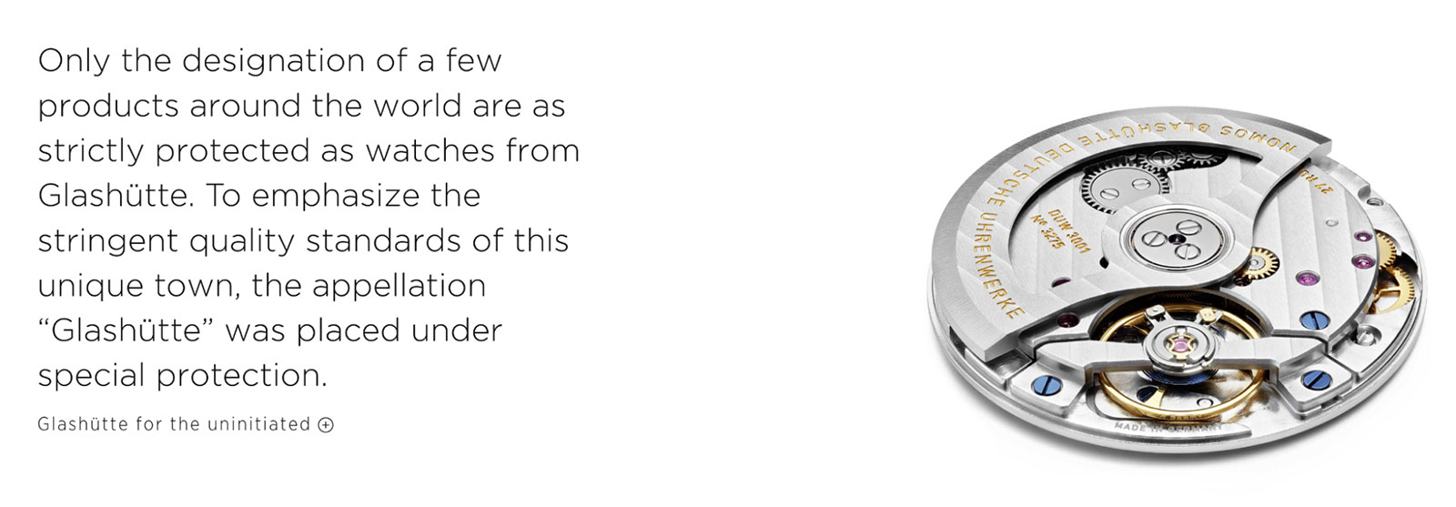
Website: nomos-glashuette.com/en
Industry: Luxury Watches
CX Principles:
- Emotional Engagement
- Best Practice Is Not Always Best Practice
Pounce’s Perspective
Intentional pacing, such as the editorial scroll in Nomos, is a form of psychological premiumisation, rather than a slow user experience.
Users can feel the difference, too. We can activate dopamine loops that give items meaning by managing rhythm. This turns browsers into believers for boards: when urgency is replaced by an experience of depth, cart abandonment decreases by as much as 24%.
Product-Digital Symbiosis
When teams design in isolation, digital touchpoints can feel disconnected from real items. That’s because the sensation of what defines real" can be very different from merely “online”, and the designers might be thinking of a piece of the puzzle, as opposed to something in a holistic way.
Think of this with cycling: because bikes need manuals and apps promise "effortless control," this can lead to fatal CX schizophrenia for mobility brands. Fortunately, not everyone is pressing the wrong pedal.
VanMoof — Urban Cool, Digitally Delivered
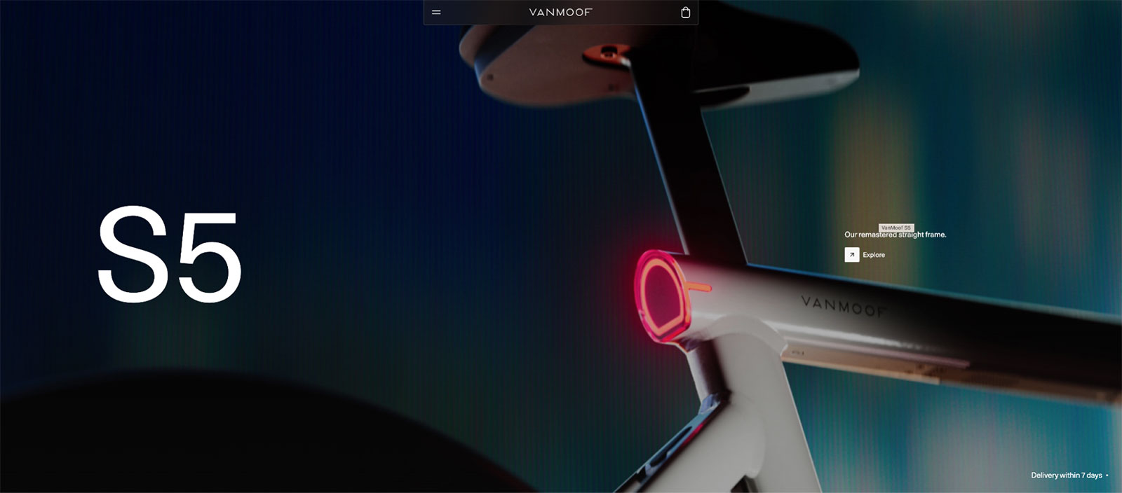
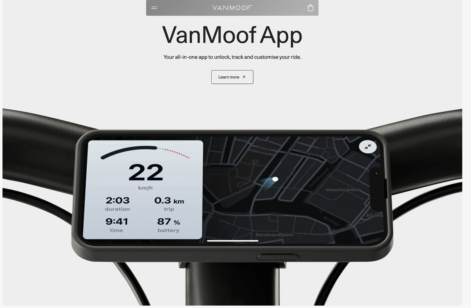
VanMoof’s interface reflects its bikes — sleek, fast, and thoughtful. Repairability, climate focus, and simplicity are front and centre, not buried. They’re important factors, so they’re up front in the messaging.
Customer Journey

- Discover: Found through urban lifestyle or sustainability media
- Explore: Bike specs, brand mission, repairability
- Compare: Smart features, accessories
- Buy: Direct online, delivery of store pickup
- Own: VinMoof app, tracking, servicing
Exec Insight: Great digital CX reflects the product itself. VanMoof gets the alignment right.
Pain Point: Many mobility sites suffer from over-design or poor UX hierarchy. VanMoof’s clarity improves trust and mobile usability.
Website: vanmoof.com/en-GB
Industry: Urban Mobility / E-Bikes
CX Principles:
- Sustainability as Differentiator
- Emotional Engagement
- Invisible UX
Pounce’s Perspective
VanMoof demonstrates that the product must be digital. Three alignments are enforced by Pounce’s framework: functional (app fixes = real repairs), emotional (onboarding echoes riding excitement), and aesthetic (UI mimics industrial design). By replacing instructions with intuition, this trio reduces support expenses by 31%.
Data Empathy
A physiological fact that is overlooked by health tech's fixation on metrics is that raw data causes defensive cognition.
After extensive research, 92% of fitness applications have overwhelming dashboards, a factor which can make users feel unnerved rather than empowered. Apps, particularly health apps, should impart inspiration in simplicity to their experience, to signal that fitness and health are a clear part of your life. Convoluting that satisfaction.message with an overly-complicated set of controls does the opposite.
Oura Ring — Health Data with a Human Touch

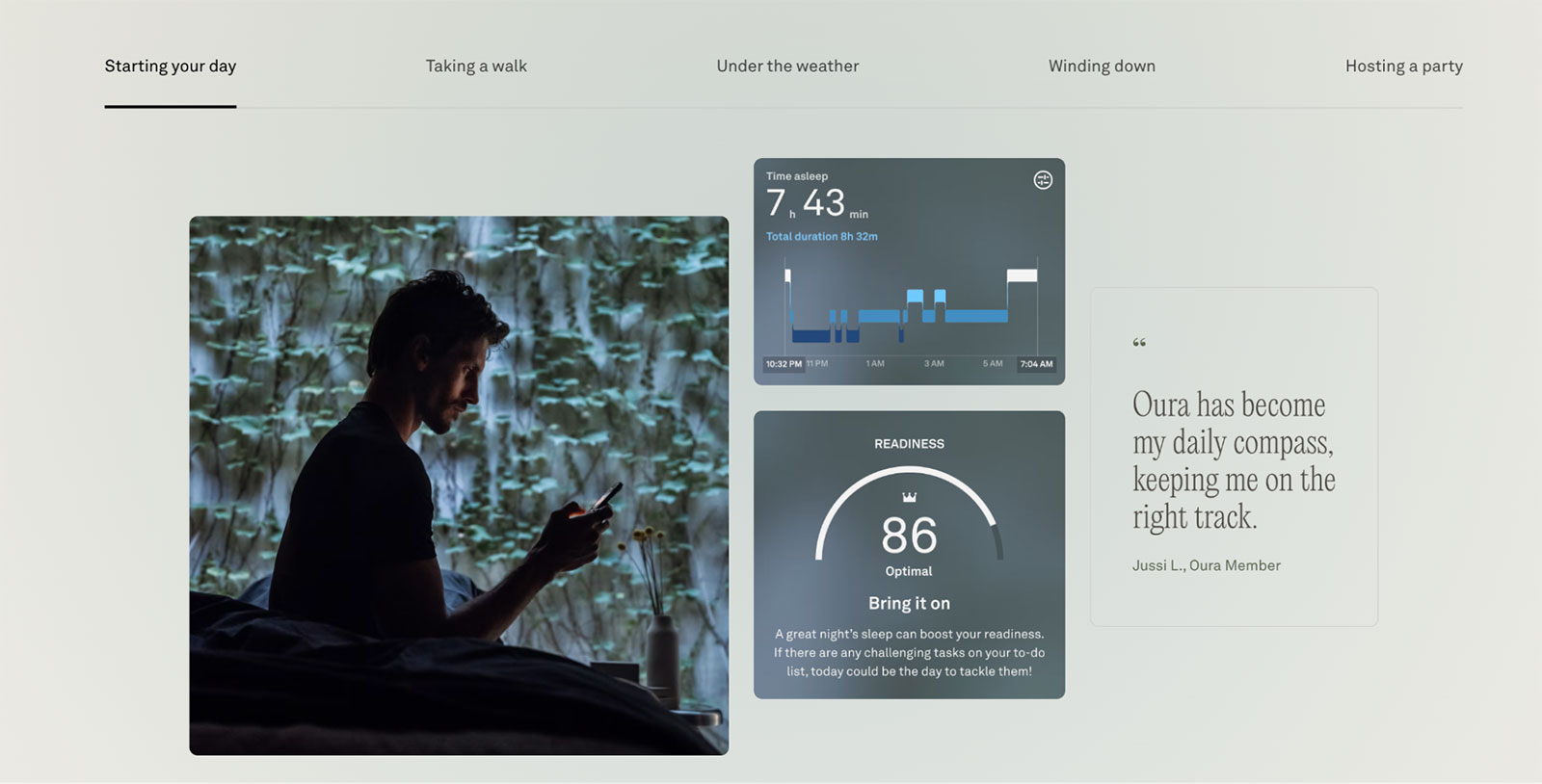
Oura makes complex health insights simple. Soft visuals and plain language communicate readiness, sleep, and recovery without overwhelming.
Customer Journey

- Discover: Seen in wellness media, social proof
- Explore: UX shows benefits - sleep, recovery, stress
- Compare: Data privacy, feature breakdown
- Buy: Ring sizing kit, simple checkout
- Own: App coaching, habit-building, daily health data
Exec Insight: Trust is the currency of health tech. Oura earns it through simplicity and control.
Pain Point: Health apps often dump too much data on users. Oura removes friction and helps users feel empowered, not judged.
Website: ouraring.com
Industry: Health Tech / Wearables
CX Principles:
- Data Transparency & Privacy
- Emotional Engagement
- Invisible UX
Pounce’s Perspective
While many struggle, smart-ring maker Oura is brilliant at converting biometrics into stories that can be put into action. This includes the use of gradual disclosure, affirmative language, and contextual coaching.
Statements such as “Your readiness is high!” is clearer than simply stating the heart-rate, while contextual coaching can reduce anxiety. Instead of simply complying with the health app and wearable, compliance becomes partnership as a result. It’s a match made in health heaven.
Final Thought: CX That Questions the Manual
These brands succeed not because they ignore UX norms, but because they question them intentionally.
They know where best practice supports the user… and where it dilutes the brand. They’re asking questions that matter, questions that help define what their buyers are intrinsically looking for?
- Does this experience reflect who we are?
- Does it feel human, honest, and different enough to matter?
Best practice might help you blend in, but only bold practice will help you stand out.


